POOR DESIGN
http://aguildedwedding.com/index.html
Overall Design:
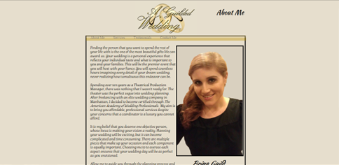
This website gives the impression that the lady is an amateur planner. The colors, or lack of color, make the website look flat, dull and boring. The black box of content makes the site appear cheap. The background of cheesy gold rings makes the script font title difficult to read. And beyond that font problem, she also uses a different font for the navigation buttons, content, and personalized notes which add up to four uncoordinated fonts.
Navigation:
The navigation buttons are always at the top and will take you to one of the four pages. The simplistic set up eliminates possible confusion. There are two links that open up another site in a new tab, but the website has relatively no depth.
Functionality:
Most ladies coming to this site would be actually looking for a wedding coordinator. In a way, it works because it allows you to “meet” her. You’re first given her picture and her info on the front page, so it’s definitely trying to appeal on a personal level. Information about her services is easily attained, so it gets the word out.
Content Quality:
The content matches the overall feel. Cheap and dull. The grammar is incorrect, and the style can be hard to read. Also, the majority of the images on the site are not complementary.
Site Effectiveness:
The website makes the lady’s services and contact information easily accessible. However, it is designed in such a way that defeats the purpose because it has very low appeal.
GOOD DESIGN
http://lolaeventproductions.com/
Overall Design:
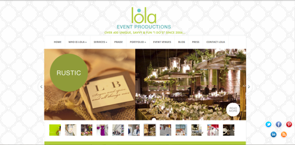
This website strikes you as modern and fresh. The select colors stand out nicely against the neutral background. The large banner of scrolling pictures first captures your attention. The content beneath the pictures is limited and formatted in symmetrical columns. The font is consistent for all the pages, and it adds to the modern simplistic feel. One thing I don’t like is how the five little buttons on the bottom right corner chase you around each page.
Navigation:
The navigation is very easy to follow. The main bar at the top conveniently allows you to go from one page to another. Also, along the right side there is a secondary navigation pane allowing you to move to various pages within the header without having to use the top bar menu.
Functionality:
This website works very well because it allows you to see many facets of the company. It gives access to practically everything a bride would want to know. The team members, wedding styles, reception venues, provided services, and much more are shown to give you a feel of their proficiency.
Content Quality:
The content has flare and polish. The text has a uniform style and sounds professionally written. Also, the mass of well-organized images harmoniously add to the text. Combined, the text and images give high recommendation to the company.
Site Effectiveness:
The site immediately draws you in by the large images on the homepage. One of the diverse styles in the rotating banner is bound to grab your attention and lure you to the next page. From there, the pictures are so captivating and the navigation is so user friendly, you don’t want to leave.