
POOR DESIGN
https://www.modernmemorydesign.com/
Overall Design:
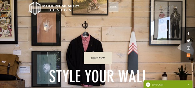
Although the homepage looks somewhat modern and appealing, and the site has some interesting features, it’s hard to locate the pages at the top and white space barely exists. Most of the background and theme is predominantly black, which is an interesting color to go with. Some might find it modern and professional, others might find it intimidating. The logo for the site is clear at the top left, and a link to “shop now” for prints is conveniently located on the homepage, so the site has some good design points.
Navigation:
Navigation is frustrating, because first the menus are located at the top right in a color that blends into the picture. Second, for most of the pages you click on, the site simply automatically scrolls you down to the appropriate section on the main page. After looking through the main page, the viewer expects new information on the “about” page or the “contact” page, but it just directs the viewer to the same pictures and text. Further, the link to the “Etsy Shop” contains over 22 pages of prints for sale, which can be tedious to look through if you don’t know exactly what category you want to explore.
Functionality:
The purpose of the site is to attract customers to explore the various retro prints presented on the site. The Website does a moderately good job, giving the link on the main page to its Etsy shop, but it fails to complement its prints with its theme colors in some ways, with a black background and red and green links. The viewer also must sort through a lot of prints, with minimal means to categorize them and narrow down their selections. Overall, the site has the features to keep viewers on the site but can be hard to navigate and might strike some viewers as unappealing at first.
Content Quality:
The content is predominantly pictures, which is important because the site is selling prints. But it lacks text, which many viewers would find interesting probably. You can’t find out much about the seller of the prints and the specifications of the pictures. There isn’t an overload of content, which is preferred, but because it doesn’t have a whole lot more than prints, besides links to Instagram and Etsy in a sidebar, it lacks some warmth and depth.
Site Effectiveness:
I don’t think the maker of this site thought through the type of people that would most likely visit his site. The site looks professional, but it doesn’t really appeal to the types of people who would buy these frames. Their target market should be women who are looking to decorate their home or commemorate a moment with a print, but the site’s dark colors and unaesthetic typography repel many of these viewers.
EXCELLENT DESIGN
Overall Design:
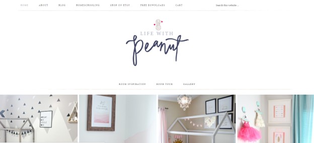
The design of this website is a lot easier on the eyes. It borders on having too much white space, but I think since the site focuses on nursery room prints, decorations, and artwork, the lighter colors go with the theme. The layout is very good, with the pages visible at the top, and the picture both on the home page and the other pages are large and simple. In some places it even implements the Fibonacci sequence, which helps the visual effect on the viewer.
Navigation:
A lot of options for navigation are on the top menu, and links as you scroll down also allow the viewer to explore with ease. There are easy links on the sidebar for most pages so that the visitor to the site can look at the Instagram page for “life with peanut”, and the pages are formatted with simple enough content so that he doesn’t have to scroll down excessively to find what he wants.
Functionality:
The best part about this website is personality within the content. Not only can the viewer visit their Etsy shop easily, and explore the different types of prints, but also the administrator gives out “freebies” for new visitors downloading prints for their nurseries and has pages for the website owner’s homeschooling life, a complete and interesting “about” page, and a gallery with links for “room inspiration” and themes to help the new mother or whoever is on the site choose the prints they want.
Content Quality:
Some of the typography is small in the text, which is somewhat distracting. Further, the pictures and type within them are sometimes cheesy or messy. However, the administrator did a really good job of being interactive with her content and creating interest. The nice thing about this site is that it doesn’t leave anything out. It goes above and beyond, without creating confusion, as the links and pages are organized to be distinguished and navigated easier.
Site Effectiveness:
As a whole, the site would be very effective in keeping the viewer engaged beyond their initial impression of the homepage. The important parts of the site are all there: the navigation, the simplicity, the information, and a layout of the decorative options. The site is fun to explore, with a blog section as well as a shop section. Further, the site’s unique, fancy typography and color scheme position themselves towards the types of people who will probably be visiting their site, setting them apart from the previous site.